Judge a Spray-Paint stencil from more than one weapon angle
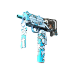
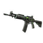
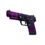
Start a stencil design with a few recognizable shapes and check how their density reads across views. Valve describes Spray-Paint as using stencil layers with triplanar mapping. For an original design exercise, the key question is whether the pattern still communicates a clear idea as the visible surfaces change, not whether one side image contains the most detail.
CASECS2Updated:
Set up a sparse-versus-dense exercise
Imagined variant
What stays the same
Question to inspect
Few broad stencil marks
Model, colors and light
Is the motif easy to recognize?
More repeated marks
Same viewing conditions
Does detail overwhelm the shape?
Another view of either
Same artwork
Does the idea survive the angle change?
Use your own abstract bars or circles rather than copying an existing finish. The exercise is about readable stencil density, not a real item’s price, rarity or paint seed. Retain a simple baseline so that a busy revision has something meaningful to compare against.
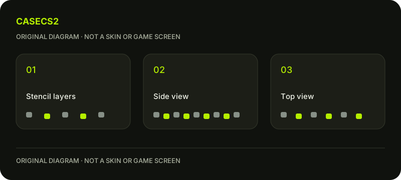
A check diagram, not a game screen.
Define the stencil’s focal relationship
Choose which mark should be noticed first and which marks support it. A repeated shape can create rhythm, but repetition alone does not guarantee a useful focal point. Sketch the intention in words before adding more marks to empty-looking areas.
The salience and contrast guide helps distinguish recognizable structure from mere saturation. A sparse version may communicate the idea more clearly than a dense one. Judge the result against your own stated aim rather than assuming that more stencil coverage always means a more finished design.
Compare side and top observations separately
Inspect the same artwork from a side view and a relevant top-facing view, recording where marks become crowded or difficult to distinguish. Do not compensate immediately by changing scale, color and material together. First describe the actual difference between the views.
If the question is how application methods behave, use the UV and triplanar guide separately. Here the design task is deciding whether the observed arrangement works. Understanding the projection is useful context, but it does not choose the density or visual hierarchy for your original artwork.
Check the normal player perspective
Return to the normal in-hand view with the same model, light and wear preview. Ask whether the stencil’s main relationship remains visible and whether supporting marks compete with it. The in-hand composition guide offers a fuller perspective checklist.
An area that is subtle from that view may still contribute in inspection, so do not automatically treat every less-visible mark as a failure. Give each view its own observation. A useful revision solves a stated readability issue instead of trying to display every stencil element equally from every possible angle.
Revise one density choice at a time
Try removing one cluster or simplifying a repeated shape while preserving the remaining conditions. Keep the original alongside the revision. A note such as “the top view has a clearer gap between marks” is more actionable than a general claim that the pattern became premium.
Use the lighting-comparison method when reflections or shadows make the density hard to judge. A brighter scene and a simpler stencil are different causes of a changed impression. Avoid merging them into one comparison and then attributing the whole effect to the artwork.
Document the stencil decision without item claims
Save the chosen density, inspected views and unresolved areas. A wear preview remains an authoring condition rather than evidence of play-induced wear or a specific owned instance. There is no need to invent a float range to make the design note seem complete.
The submission review guide keeps later publication and selection distinct. This exercise does not produce a tradable skin or guarantee a classification. Its useful result is an original stencil with a defensible relationship across views and a recorded next step for any area that still feels crowded.
Sources checked on 2 November 2026. Labels and locations can vary by client version and language. Match the described state in your own current interface.
Help
Questions and answers
What you should know before you begin.
Is a denser stencil always better?
No. Compare whether the intended focal structure remains readable.
Can a side image settle every view?
No. Inspect relevant top and normal in-hand views under comparable conditions.
Does this exercise determine a rare pattern?
No. Authoring density decisions do not establish item rarity or ownership.