Make a CS2 finish readable without treating saturation as rarity
Valve describes salience in terms of how noticeable and recognizable a design is, with value and color contrast contributing to readability. It is not simply maximum saturation. Compare the intended focal structure under consistent conditions, and do not treat a brighter design as a guaranteed Covert selection, price premium or gameplay advantage.
CASECS2Updated:
Choose a readability question
Observation
Useful test
Unsupported conclusion
Focal mark disappears
Compare value structure
The design must become brighter everywhere
All areas compete equally
Review focal and supporting contrast
More saturation guarantees quality
Design looks clear in one view
Repeat under comparable conditions
Official rarity is established
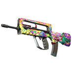
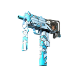
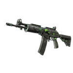
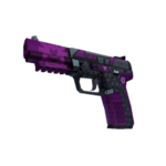
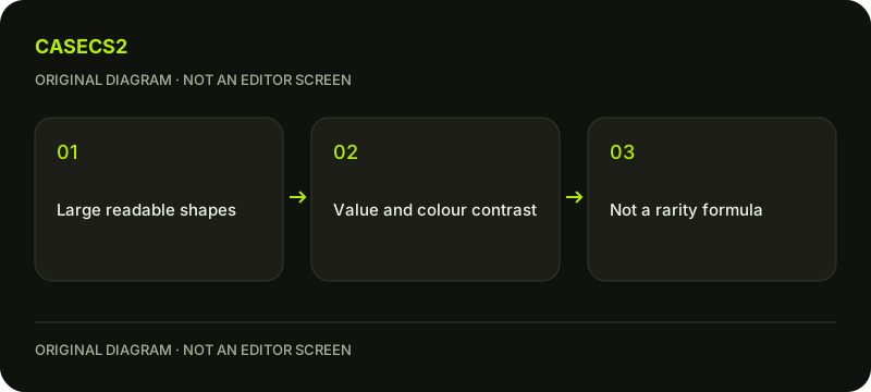
Imagine two original variants of a geometric pattern: one has equal emphasis everywhere, while another reserves contrast for a focal shape. The question is whether that focal relationship reads, not which one is guaranteed to sell for more or receive a specific rarity label.
A check diagram, not a game screen.
Read salience as more than saturation
Valve’s style guide links salience with noticeability, recognition and contrast. Color is one contributor, but value differences and the organization of shapes also matter. A highly saturated field can still leave the intended motif difficult to distinguish.
The guide also values quieter designs for different uses. Do not turn its discussion of tier audiences into a formula that an author can apply to assign official rarity. The rarity and collection guide explains existing item labels; this page instead examines an author’s design readability before any selection decision.
Make an original grayscale comparison
Arrange two variants of your own artwork under the same weapon, style, light and wear conditions. Inspect a grayscale version as a diagnostic for value structure, then return to the full-color result. This is a practical author exercise, not a claimed numerical proof of quality.
Look for the main shape, its supporting areas and any region that overwhelms the composition. Record the observation in ordinary language. Do not invent a luminance threshold or pretend one grayscale image measures every aspect of a material. A reflective surface still needs its own lighting context.
Return to color without changing everything
After the value check, inspect how color separates or unifies the same shapes. Compare one deliberate change rather than simultaneously increasing brightness, saturation and contrast across the entire design. The lighting guide helps keep the scene comparable.
Valve cautions that overly bright, dark or saturated finishes can look wrong under lighting. That is not an instruction to make every design neutral. Preserve the intended character and examine the actual result. The PBR albedo guide separates source material from a screenshot’s baked lighting contributions.
Keep official rarity outside the test result
A more noticeable motif does not let you set an official rarity, calculate drop odds or promise a premium. The Classified and Covert explanation concerns existing classifications, not an editor control assigning them to a private design.
Likewise, community votes and an appealing comparison are not guarantees of selection. The submission review guide describes that boundary. Do not add a rarity badge to a design presentation in a way that implies Valve already issued the classification or accepted the finish.
Write a useful design conclusion
State whether the main shape is easier to recognize, which supporting region changed and what conditions were held constant. If your judgment is subjective, label it as such rather than creating an exact score from visual preference.
The before-and-after board guide offers an organizational method for keeping variants comparable. An improved board does not change an owned item or establish gameplay effectiveness. The task is complete when the intended readability question has a clear observation and a next design choice, not when a bright screenshot is declared a guaranteed valuable release.
Sources checked on 2 November 2026. Labels and locations can vary by client version and language. Match the described state in your own current interface.
Help
Questions and answers
What you should know before you begin.
Does more saturation guarantee a better design?
No. Readability also depends on value contrast, structure and the lighting response.
Can this test assign Covert rarity?
No. An author’s comparison does not establish official item classification.
Is a grayscale comparison an objective quality score?
No. It is a diagnostic for value structure, not a complete numerical evaluation of the design.