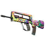
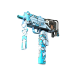
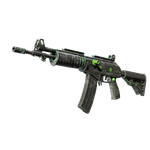
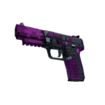
Compose a CS2 finish for the in-hand view, not only a side poster
Valve’s style guide emphasizes the normal in-hand perspective because that is where players spend much of their time seeing the weapon. Start by checking whether the main motif works with the weapon’s shape in that view. A beautiful flat side image or edited promotional poster cannot substitute for the finish’s actual in-hand composition.
CASECS2Updated:
Define what the viewer should recognize
Design element
In-hand question
Supporting view
Main motif
Is the intended idea readable?
Inspect view for detail
Supporting marks
Do they support the weapon shape?
Side view for arrangement
Hidden or covered region
Is essential meaning lost there?
Another relevant actual view
Imagine your own abstract ribbon design with one focal emblem. A side image might show the entire ribbon, while the normal player view exposes only part of it. Identify what must remain readable rather than declaring the unseen portion a failure or moving the viewpoint to avoid the question.
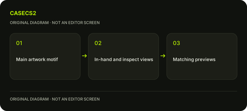
A check diagram, not a game screen.
Start from the actual player perspective
Use the chosen weapon’s normal in-hand view in the available preview context. Record the weapon, hand or view setting, light and wear. Do not invent visibility percentages or coordinates for a model you have not measured.
Valve encourages illustrations to interact with the weapon’s form rather than look pasted onto a flat surface. Follow that design question with original artwork. The first-finish guide provides general preparation, but this check is narrower: does the intended composition make sense from the perspective where it will ordinarily be seen?
Review focal and supporting areas
Identify the primary motif, supporting detail and parts obscured in the chosen view. Ask whether the visible arrangement still communicates the design’s purpose. An essential mark placed entirely out of view may call for a composition revision, while a subtle supporting detail may work differently.
Change one arrangement choice and compare under the same conditions. Do not use a new camera, lighting setup and material revision together, then attribute every improvement to composition. Keep the original idea recognizable in your notes so that the next comparison evaluates the intended change rather than a different design.
Use inspect and side views as complements
Valve’s style guide describes clear inspect, in-hand and side screenshots without postprocessing, while allowing promotional images as additional presentation. Treat those views as complementary evidence rather than selecting only the most flattering one.
The view-selection guide explains another visual-review context for existing items. Your authoring purpose here is not to certify an owned asset: it is to show how the original design relates to the model. Label editor images accordingly and do not imply that a consumer comparison tool imports your Workshop project automatically.
Hold viewing conditions steady
Keep the same weapon, view settings, light and wear for the comparison. The lighting guide helps prevent a different scene from masquerading as a better composition. A handedness setting is also a viewing condition, not a change in float or ownership.
Do not remove hands, alter field of view through an unverified command or change protective game settings just to make an illustration fit a poster. The aim is a readable normal perspective, not a manufactured view that avoids how the finish is actually presented.
Document what improved without overstating it
Write which motif became clearer and which view established that result. Preserve less successful views where they reveal an unresolved composition issue. The submission review guide explains why presentation is still separate from official selection.
A strong in-hand comparison does not create a tradable item, guarantee acceptance or establish market value. It also does not prove a gameplay advantage. Finishing this task means that the design’s focal idea and supporting detail have been examined in a relevant perspective, with the actual viewing conditions kept explicit.
Sources checked on 2 November 2026. Labels and locations can vary by client version and language. Match the described state in your own current interface.
Help
Questions and answers
What you should know before you begin.
Is a side promotional image enough?
No. It complements rather than replaces a clear normal in-hand composition check.
Should I change view settings to make every motif visible?
Do not invent special camera commands as a fix. Evaluate the design within the relevant normal perspective.
Does the comparison import my design into the site’s tools?
No. An authoring project and the site’s supported existing-item records are separate.