Design a readable Solid Color finish with a limited palette
Begin a limited-palette design by assigning a purpose to each visible region: a calm base, a supporting area and an optional accent. Valve describes Solid Color as using up to four colors on predefined weapon regions. The practical question is which relationships make your own design readable, not how many bright colors you can fit into a preview.
CASECS2Updated:
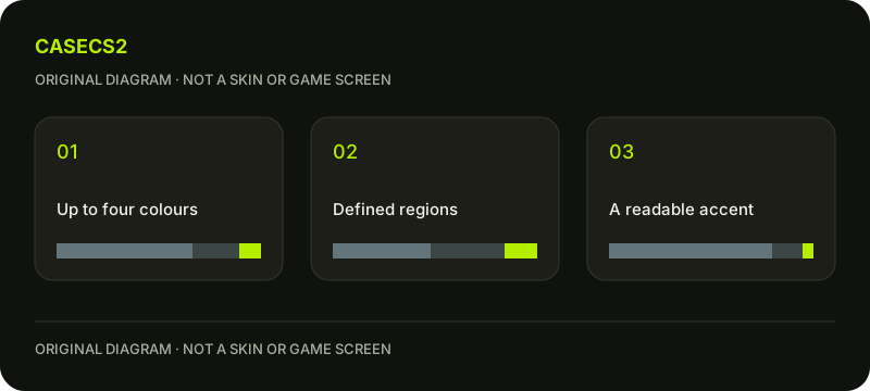
Build a hypothetical palette plan
Region role
Original exercise choice
Review question
Base
Muted blue-gray
Does it support the weapon shape?
Supporting area
Dark neutral
Is the division intentional?
Accent
Small warm highlight
Does it draw attention to the intended place?
These are imagined design choices, not measurements or a named skin. Start with a sketch that labels the roles without assigning price or rarity. If every area demands attention, the palette may lack hierarchy even though each color looks appealing alone.
A check diagram, not a game screen.
Choose one main idea before another color
Write a short statement such as “a quiet body with one clear accent.” Use it to decide whether a proposed color supports the goal. A new color should answer a design need rather than fill an unused slot merely because it is available.
The in-hand composition guide helps identify what is normally visible. A color division that looks balanced in a flat side image may not read the same way from the player perspective. Keep the intended view beside your palette note before revising the whole arrangement.
Compare two region decisions
Prepare an original version with the accent on one relevant region and another with that region kept quiet. Preserve the model, view, light and wear preview so that the comparison concerns this one decision. Use current supported tools rather than assuming a fixed button layout.
Describe what changed: perhaps the outline is clearer, or the accent competes with another shape. Avoid a vague “better” without saying why. The useful observation names a visible relationship, which makes the next revision easier to explain and prevents a sequence of unrecorded color changes from replacing the initial design purpose.
Check values before chasing saturation
Inspect whether the selected areas remain distinguishable when viewed as simple light and dark relationships. Then return to the color image. This is a practical reading check rather than a numeric test of quality. The salience guide develops that broader contrast question.
If the accent disappears, consider its relationship to neighboring regions rather than increasing every channel at once. A calmer supporting area may help more than a brighter accent. Keep the original version for comparison so that a later judgment can be tied to a specific change instead of a memory of how vivid the first preview seemed.
Inspect comparable light and wear previews
Use a familiar view, then deliberately inspect another light condition while keeping the palette fixed. The lighting guide explains why a scene change should not be mistaken for a source-color edit. Label authoring previews clearly.
A wear preview is a way to examine the design under a chosen condition, not proof that playing changes a purchased skin. The wear-lifecycle guide concerns actual items. Do not borrow a rough-looking preview as evidence of an instance’s float or invent a universal threshold for this style.
Keep the conclusion about the palette
Record which region gained or lost emphasis and whether the result matches your original purpose. If only the side view was checked, leave the player-view judgment open. Keep a specific note alongside the compared images.
The submission review guide separates design evidence from publication and selection. This palette exercise does not create an inventory item, establish a market classification or promise acceptance. Its endpoint is a defensible color relationship and a clear next revision, with the conditions kept alongside the images.
Sources checked on 2 November 2026. Labels and locations can vary by client version and language. Match the described state in your own current interface.
Help
Questions and answers
What you should know before you begin.
Must I use every available color?
No. Use a color when it serves the intended region relationship rather than filling a slot.
Does an attractive preview prove rarity?
No. A private design comparison does not establish official rarity or an existing item.
Should wear previews be compared under different light?
For a controlled palette comparison, keep conditions fixed first and vary light as a separate check.