Patina: plan a warm-and-cool material study with a clear purpose
Treat your original study as a relationship between areas, not as a painted emblem that needs to be read like a logo. Start with a warm main field and a quieter cool response. Then compare whether the arrangement communicates a coherent surface character under the same observation conditions. Valve describes Patina as using a full-colour image through existing UVs.
CASECS2Updated:
Build a two-area study
Original area
Initial intention
Comparison question
Warm main field
Establish the overall character
Does it remain the main impression?
Cool supporting field
Provide a restrained response
Does it support rather than fragment?
Boundary
Connect the areas
Does it feel deliberate?
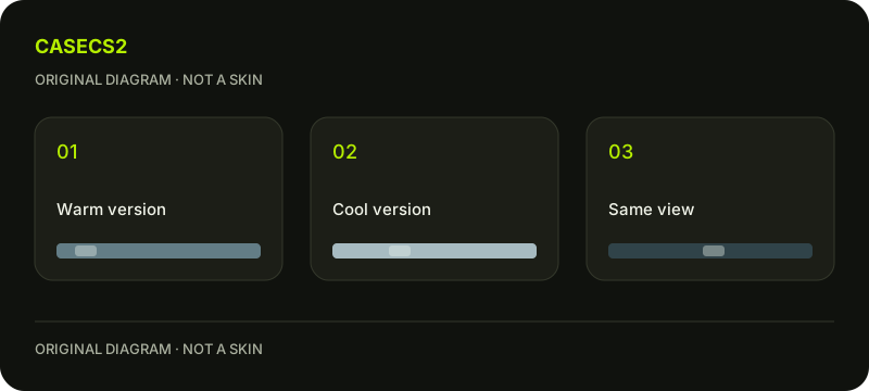
Use your own broad shapes and colour choices. These are hypothetical design roles, not a chemical recipe or a description of an existing finish. Prepare a second version with a quieter supporting area while leaving the main field unchanged.
A check diagram, not a game screen.
Describe character without an age story
Write a short intention such as “warm overall, with a restrained cool interruption.” This gives you something to review without inventing a history for the surface. A convincing impression does not need an unsupported account of how an owned object supposedly aged.
Avoid introducing a prominent symbol simply because the study feels unfinished. First ask whether the broad relationships work. If you later want an emblem, make that a separate composition decision rather than a substitute for resolving the underlying balance.
Compare the supporting field
Look at both versions at the same size and from the same angle. Describe whether the cool area helps the warm field feel cohesive or divides it into unrelated patches. Do not change the main field while deciding this question.
The albedo and lighting guide helps distinguish colour decisions from the resulting image. Keep your notes similarly specific: which area changed, what stayed fixed and what impression became easier to perceive.
Inspect the boundary without decorating it
A strong boundary may become the main feature even when that was not your intention. Try a version with less competing activity near it and compare the overall effect. Adding more marks everywhere can make the original issue harder to locate.
Use the contrast review to decide whether the boundary deserves attention. There is no universal requirement to hide it. A clear division can work if it supports the chosen character and remains consistent with the rest of your composition.
Check the whole before interpreting details
Return to the assembled weapon and the normal player perspective. A local colour relationship may look appealing in isolation but feel disconnected when seen with the rest of the model. Keep both observations rather than declaring one irrelevant.
Repeat the comparison under matched lighting. If you also examine a different environment, save it as another observation. Do not attribute every apparent change to the artwork when the conditions changed too.
Finish with a material-design note
Save the two versions and write why you prefer one. A useful conclusion might be that the quieter cool field preserves a warm overall impression while the boundary still needs attention. That provides a manageable next edit.
The submission guide separates a finished study from later publication decisions. A preview does not modify Steam inventory or establish an item’s age. Keep the conclusion about your design relationship, without inferring ownership, market value or a real chemical process.
Sources checked on 2 November 2026. Labels and locations can vary by client version and language. Match the described state in your own current interface.
Help
Questions and answers
What you should know before you begin.
Should this study begin with a logo?
Not necessarily. Establish the broad surface character first, then decide whether a graphic motif serves a separate purpose.
Can I identify an item’s age from this appearance?
No. Your design exercise supplies no history for an actual item.
What if the boundary becomes the strongest feature?
Decide whether that emphasis matches your intention. Compare a quieter neighbouring area before making unrelated changes.