Glossy sticker design: make a small original silhouette recognisable
Build the outline before decorating the surface. A small sticker needs a shape that can survive reduction without turning its important gaps into accidental holes or closing them entirely. Valve lists standard glossy stickers among supported sticker appearances. This exercise uses your own folded-bird symbol to decide what the silhouette must communicate before interior detail is allowed to compete.
CASECS2Updated:
Make an outline-and-gap comparison
Original drawing
Deliberate choice
Review question
Bird A
Narrow opening beneath the wing
Does the opening survive reduction?
Bird B
More open separation
Does the wing still feel connected?
Plain silhouette
Interior lines hidden
Is the bird still recognisable?
Draw the symbol yourself rather than tracing an existing sticker. Keep the outer dimensions comparable in A and B. The exercise concerns shape organisation, so leave colour variation until you know which outline and gap relationship you want to keep.
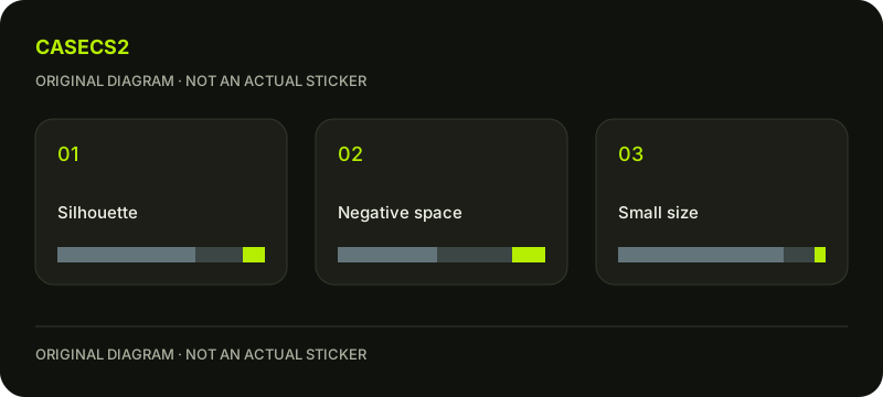
A check diagram, not a game screen.
Decide what makes this bird identifiable
List the minimum cues: a pointed head, a folded wing and a gap that separates the wing from the body. These cues give the drawing a testable intention. If the design is meant to be abstract instead, describe the movement or balance you want a viewer to perceive.
Hide the decorative lines and look away briefly before returning to the image. Write what you actually see first. Familiarity with your own drawing can supply information that a new viewer does not have.
Inspect negative space as a shape
Treat the opening beneath the wing as a designed area, not leftover background. Compare whether it resembles an intentional separation or an unrelated puncture. A larger gap may improve clarity but weaken the connection between the parts; record both effects.
Use the salience and contrast questions to describe the reading order. Avoid solving every problem by thickening all lines, because that can change the very spaces you are trying to preserve.
Reduce before restoring interior marks
Review the silhouette at a smaller presentation size, then return to a larger image for local inspection. These are two separate tasks. A missing decorative fold line may be acceptable, while a missing wing opening may change the subject entirely.
Restore one interior mark at a time. If it helps explain the fold, keep a version with it. If it merely adds another dark interruption, compare the simpler version again. The paper, holo and foil overview provides appearance context without deciding this drawing problem for you.
Test the symbol against a plausible surrounding field
Place your original study beside a quiet field and a busier one in your design document. Label both as hypothetical contexts. Ask whether the outline remains separable, rather than claiming either image reproduces a particular owned item.
The sticker placement review helps frame a later composition question, while in-hand composition reminds you to consider normal viewing scale. Keep the sticker drawing decision separate from the arrangement around it.
Keep a small-size verdict
Save the plain silhouette, A and B, and the smallest view that still answers your recognition question. Note which cue survives, which detail can disappear and which gap needs revision. This becomes a practical brief for the next drawing pass.
The submission guide concerns later publication decisions. Your preview neither applies a sticker to Steam inventory nor establishes a tradeable item. The useful outcome is a readable original symbol with an explained simplification, not a promise about selection or value.