Foil sticker design: separate relief cues from drawn linework
Decide which forms should read as raised before using bright marks to make the drawing look dimensional. A highlight can draw attention without explaining the structure you intended. Valve describes embossed foil stickers as simulating adhered metal leaf. Use an original mountain emblem to build a relief plan that remains understandable when the most flattering bright area is not doing all the work.
CASECS2Updated:
Write a structural plan for an original emblem
Element
Intended reading
Review question
Mountain outline
Main raised shape
Is the silhouette still clear?
Inner valley
Recessed relationship
Does it read as space rather than ink?
Small summit mark
Supporting detail
Does it explain or distract?
Draw the emblem yourself and keep an unshaded reference. These are design intentions, not exact material settings. Save the plain drawing beside your relief study so that you can distinguish a shape decision from an appealing surface effect.
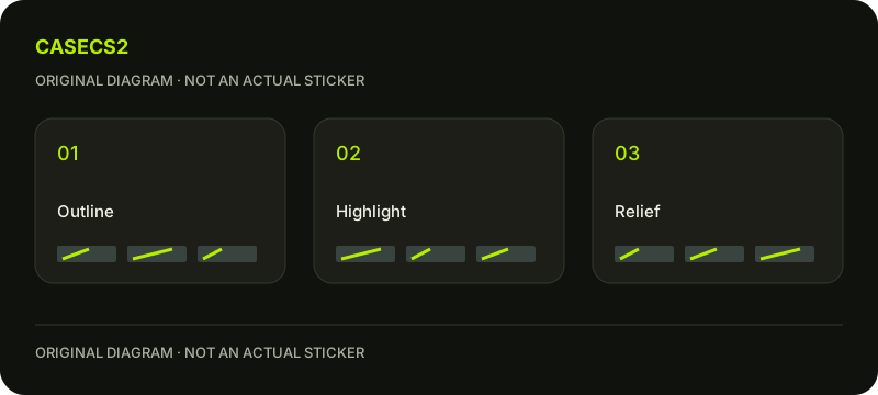
A check diagram, not a game screen.
Describe which form sits in front
Write a simple relationship such as “the ridge stands forward and the valley remains quieter.” If you cannot describe that arrangement without pointing to a bright streak, the structural idea may still be unclear.
Sketch a simplified version with only the main ridge and valley. Check whether adding the summit detail improves the relationship or merely creates a competing focal point. The goal is not maximum complexity; it is a relief idea that can be explained consistently.
Inspect the drawn contours first
Look at the unshaded emblem and trace its main outline. Identify any place where the mountain’s shape depends on a tiny internal line. Decide whether that line belongs to the subject’s identity or is optional decoration.
The normal-map depth explanation gives context for separating visual depth from geometry. Keep this author exercise about the intended reading, without assuming the preview physically changes the shape of a real object.
Compare the bright observation with the structural plan
Review a view where a bright area emphasises the ridge, then another where that emphasis is less helpful. Note whether the valley remains understandable. Do not redraw a permanent bright stripe simply because one observation looked impressive.
Prepare a version without the summit mark and compare it with the original relief plan. If the main shape becomes clearer, consider retaining the simpler interpretation. If the mark helps establish the mountain’s direction, preserve that function but review its prominence.
The salience review helps describe the attention order. Keep the contour, relief intention and viewing conditions stable during this small comparison so that the effect of the removed detail remains explainable.
Save a relief note instead of a single winning image
Keep the plain emblem, the structural sketch and at least one less flattering observation. State which forms read clearly and which still rely too heavily on a bright effect. A targeted next step might simplify the valley junction while preserving the ridge outline.
The submission guide addresses a separate stage. A preview does not apply or scrape a real sticker, and your study does not establish an owned item’s properties. The outcome is an original relief plan, not a claim of selection, rarity or value.