Recolourable sticker design: preserve roles across palette variants
Create two palettes for the same original drawing and ask whether both preserve the intended reading order. A recolour can keep every contour unchanged while making the wrong area dominant. Valve describes color-replace stickers as using a mask for recolouring. This exercise uses an original cup-and-steam symbol to review role consistency, rather than prescribe a technical mask workflow.
CASECS2Updated:
Give the palettes matching jobs
Role
Cool-led variant
Warm-led variant
Cup body
Muted blue
Muted warm tone
Steam
Clear supporting contrast
Clear supporting contrast
Small mark
Restrained accent
Restrained accent
Draw the cup and steam yourself. The table describes visual roles, not required colours or an implementation format. Save a neutral reference drawing and keep the outlines and region positions unchanged while comparing the two original palettes.
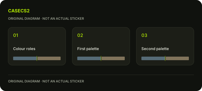
A check diagram, not a game screen.
Write the reading order before choosing hues
Decide whether the viewer should first see the cup, the steam or the small mark. For this study, make the cup primary and the steam its identifying support. The accent should add interest without becoming a separate logo.
Describe the roles in words that apply to both palettes. “The blue area wins” cannot serve the warm-led variant, but “the cup remains primary” can. This makes the comparison about coherent design rather than loyalty to one favourite colour.
Compare the whole symbol before individual swatches
Look at each variant at the same size. Note the first recognisable element and the next supporting relationship. Do not judge the accent by its attractiveness alone; ask what it does to the surrounding drawing.
The salience and contrast guide provides useful attention questions. If the accent dominates only in the warm-led version, keep the cool-led drawing unchanged while preparing a more restrained warm accent for comparison.
Inspect boundaries where roles can reverse
Check the separation between cup and steam and the small space beside the accent. A new hue relationship can make a previously clear region merge with its neighbour or seem detached from the subject. Record the actual boundary rather than concluding that the whole palette failed.
The albedo and lighting explanation helps distinguish an input relationship from a particular rendered impression. Keep the comparison conditions stable while choosing which boundary needs a colour revision.
Recheck the family at a smaller presentation
Place the two variants side by side and reduce the view. Do they still feel like versions of the same cup symbol, or does one become an unrelated bright mark? Keep the neutral reference nearby so that you can identify which relationship disappeared.
Use the sticker appearance overview for broader context and the placement review for a separate surrounding-composition question. Neither replaces this palette test or implies that a design document can recolour an owned sticker.
Save the invariant roles and the permitted differences
Write what both variants must preserve: the cup first, a connected steam shape and a modest accent. Then list the differences you accept, such as a calmer cool-led impression and a warmer alternative with slightly stronger contrast. Coherence does not require identical emotional character.
The submission guide addresses later publication. A preview does not modify Steam inventory or create a tradeable variant. Keep a separate next edit for each palette instead of merging every attractive choice into one increasingly crowded drawing.