Anodized Multicolored: balance neighbouring colours before adding complexity
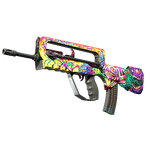
Start with the relationship between neighbouring colours, not a competition to make every region equally vivid. This original exercise places a cool field beside a warmer accent and asks whether the shared boundary remains clear when the whole design is viewed. Reflection is an additional observation, not a replacement for colour hierarchy. Valve describes Anodized Multicolored as combining a multicoloured pattern with a metallic finish effect.
CASECS2Updated:
Make an adjacent-colour comparison
Hypothetical version
Deliberate change
Review question
A
Cool field beside warm accent
Is the intended hierarchy clear?
B
Same field, quieter accent
Does the boundary feel less competitive?
Additional view
Same version under another light
Does emphasis shift?
Draw a simple original banded pattern. Keep the bands in the same positions in A and B. This is a palette exercise, not an example of a named skin, a preset or a claim about a real item’s classification.
A check diagram, not a game screen.
Choose the main colour relationship
Write which colour should establish the overall identity and which should provide contrast. If both are intended to be equally important, explain how the pattern holds them together. Without a stated relationship, every new variation can feel attractive for a different reason.
View the two colours together rather than selecting them from separate swatches. The decision concerns their interaction on your design. A colour that looks restrained alone may feel dominant beside a quieter neighbour.
Keep the pattern fixed during the palette test
Compare A and B without moving the bands or changing their widths. First describe the boundary, then the overall balance. If B seems calmer, identify whether the accent stopped competing or whether the whole design lost a necessary point of interest.
The RGB colour-mask guide addresses a separate representation question. Here the useful author decision is which relationship to keep. Avoid changing both the pattern organisation and the palette before that decision becomes clear.
Separate reflection from the colour decision
Use a matched view for the initial comparison, then observe the selected version in another lighting situation. Record whether a bright area redirects attention toward a boundary that previously seemed quiet. Keep the original colour conclusion and the new observation side by side.
Reduce the image to a normal viewing size. Can you still describe the main colour and its supporting accent, or do the bands become several unrelated fragments? Inspect the player-view composition before selecting a version based only on a large side image.
If the pattern feels fragmented, try one change to the accent relationship before adding more colours. Adding a third competing area can make it harder to understand why the first two did not work together.
Keep an explanation with the chosen version
Save A, B and the additional lighting observation with clear labels. Write one reason for the choice and one remaining question. For example, the quieter accent may improve the overall balance while one particular view still needs attention.
Review submission and selection separately. The resulting Workshop preview is not tradeable inventory and does not imply rarity or price. Your useful outcome is an explainable relationship between adjacent colours, supported by the actual views you examined.
Sources checked on 2 November 2026. Labels and locations can vary by client version and language. Match the described state in your own current interface.
Help
Questions and answers
What you should know before you begin.
Should every colour be equally vivid?
Only if that serves your intended relationship. Compare a quieter accent before assuming equal intensity is necessary.
Can I change band placement during the first comparison?
Keep it fixed initially so that you can judge the colour decision itself.
What if another light changes the emphasis?
Keep that observation and its conditions. Decide whether it matters for the intended composition rather than discarding the inconvenient image.