Paper-backed sticker design: give the border room to support the motif
Design the space between motif and edge before polishing the frame. A border can hold a drawing together, but it can also compress the subject or become the first thing a viewer notices. Valve describes paper-backed glossy stickers as having a paper adhesive backing. The exercise below uses an original lantern drawing to separate useful framing from unnecessary crowding.
CASECS2Updated:
Separate margin from border weight
Original variant
Change
Question
A
Close frame, unchanged lantern
Does the subject feel compressed?
B
More inner space
Does the frame still connect the design?
C
Same space, quieter border
Which element reads first?
Draw a simple lantern with a handle and a clear central body. Keep it unchanged while comparing A and B. Use C only after deciding the spacing, so that border weight does not become an accidental second variable in the first comparison.
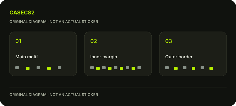
A check diagram, not a game screen.
Give the frame a job
Write whether the frame should unify the sticker, separate it from its surroundings or echo the lantern’s shape. One primary job is enough for the first draft. A border that tries to be another illustration may compete with the lantern instead of supporting it.
Temporarily hide the frame. If the subject loses no useful relationship, ask what the frame contributes when restored. This does not mean removing every decorative edge; it means keeping an explanation for the space and emphasis it consumes.
Follow the narrowest passages
Inspect the distance between the handle and the upper edge, then the spaces near the lantern’s corners. These local areas can feel squeezed even when the average spacing seems generous. Note the exact passage that creates the impression.
Use the contrast and salience review to ask whether a narrow bright channel attracts unintended attention. Compare a targeted spacing change before moving the whole subject and redrawing the entire border.
Judge the border as part of the silhouette
Reduce the drawing and look at its overall shape. Does the edge make the lantern easier to locate, or does the frame read as a separate badge with an indistinct centre? Keep the answer distinct from whether the decorative pattern is attractive when enlarged.
The sticker appearance overview supplies broader context. This particular exercise concerns your frame geometry and inner space, not scraping, wear or the behaviour of an existing sticker.
Try a surrounding composition without changing the drawing
Place the preferred draft beside a calm field and a more active hypothetical field. Keep the lantern and border identical. Describe whether the edge provides useful separation or simply repeats surrounding visual noise.
The placement review and in-hand composition check help distinguish a clear drawing from a suitable larger arrangement. Do not use a flattering context to conceal an unresolved narrow passage inside the sticker itself.
Record a border decision with its trade-off
Save a view of the whole sticker and a close view of the tightest passage. Explain why the chosen spacing works and whether the frame still needs simplification. For example, the wider upper margin may protect the handle while requiring a quieter corner ornament.
Refer to submission and selection for the later publishing question. A design preview does not apply or scrape an owned sticker. Your result is a documented framing choice, with no inference about a real item’s backing condition, rarity or market price.