Holographic sticker design: protect the focal shape across angles
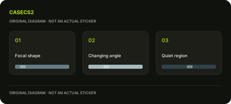
Give the sticker a focal shape that can be discussed independently of its most striking colour appearance. Then decide what the surrounding region should contribute as the view changes. Valve describes holographic sticker effects as view-angle dependent. This exercise uses an original compass-like arrow and a quieter ring to judge whether the arrow remains the intended centre of attention.
CASECS2Updated:
Assign focal and supporting roles
Original region
Role
Observation question
Arrow
Main recognisable shape
Is its direction still clear?
Ring
Supporting enclosure
Does it remain secondary?
Small marks
Optional rhythm
Do they distract at a particular view?
Use your own abstract arrow rather than a copied team identity. Keep a simple reference drawing without decorative marks. This gives you a stable reminder of the subject while comparing changes in the perceived emphasis of different regions.
A check diagram, not a game screen.
Define what must survive the view change
Write a minimum condition: the arrow tip and its direction should remain distinguishable from the ring. You are not requiring every observation to look identical. You are identifying the part of the composition that carries the idea.
If your intention is instead an ambiguous shifting symbol, state that clearly and define the intended ambiguity. A focal-shape exercise needs a different criterion from an artwork designed to conceal its subject. Keep the criterion visible beside the comparison images.
Write separate notes for different views
Review the same design from several relevant directions and label each observation. Record whether the arrow, ring or small marks attract attention first. Avoid summarising the whole set as simply “more colourful” or “less colourful.”
The paper, holo and foil guide supplies appearance context. Your own question remains which region leads the composition in each view. If one view reverses the hierarchy, preserve that evidence before making a revision.
Simplify the support before strengthening everything
Create a second version with fewer small ring marks while leaving the arrow unchanged. Compare it with the first design under the same observation conditions. Does the arrow become easier to locate, or did the removed marks provide useful separation?
Use the contrast and salience review to describe that difference. Making every region more intense can preserve the competition instead of solving it. A selective reduction gives you a clearer explanation of what helped.
Check the composition beyond the close view
Reduce the presentation and see whether the arrow direction remains readable. Then inspect a hypothetical surrounding arrangement without changing the sticker itself. Keep these results separate: a clear isolated symbol can still become lost in a busy composition.
The placement review and in-hand composition check help organise those broader questions. Do not imply that a design-document arrangement applies anything to an existing weapon or proves a real item’s appearance.
Retain an angle-specific revision list
Save one note per view, identifying the leading region and the unresolved problem. Choose a targeted next revision, such as calming the ring where it repeatedly competes with the arrow. Do not delete an inconvenient view merely to create a single favourable verdict.
The submission explanation concerns later publishing. A preview is not tradeable inventory and does not alter an owned sticker. Your useful result is a focal relationship with known limitations, rather than a promise of identical colour at every angle or guaranteed selection.