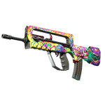
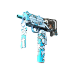
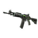
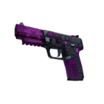
Compare an Anodized color without painting the reflection into it
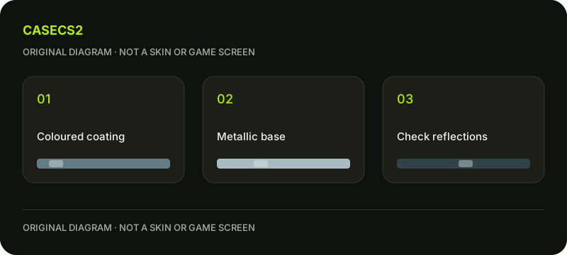
Begin with one original color study and inspect it under several clearly labeled lighting conditions. Valve describes Anodized as emulating a colored coat over a chrome base. The practical design task is distinguishing the intended color impression from reflections, rather than correcting every bright or dark patch as if it were painted into the artwork.
CASECS2Updated:
Plan three separate observations
Imagined view
Question
Avoid inferring
Neutral comparison
Is the intended color readable?
One screenshot reveals every input
Brighter condition
Does a highlight obscure the idea?
The bright patch is painted white
Shaded condition
Does the color relationship remain useful?
The source color changed automatically
Choose your own hypothetical blue or warm-toned study, not an existing skin identity. Label the views before comparing them. A changed impression can be an expected viewing difference without proving which edit should be made to the source.
A check diagram, not a game screen.
Describe the intended color in ordinary language
Write a short aim such as “a restrained cool color with a clear metallic impression.” This provides a reference for decisions without pretending that a phrase supplies a universal numeric preset. Keep the intended region and viewing context with that note.
The PBR albedo guide separates source material information from a rendered screenshot. Do not sample a highlight from one picture and assume it represents the intended underlying color. First understand what you want the material to communicate across the views you actually plan to inspect.
Compare light without changing the color first
Keep the model, style, wear preview and chosen color fixed. Observe a familiar neutral comparison, a brighter condition and a shaded condition deliberately. Describe what remains recognizable and what becomes difficult to read.
The lighting guide helps preserve that comparison discipline. Avoid changing color, view and material settings together to rescue one image. A useful note can say that a highlight dominates a small region while the overall color remains clear; it does not have to declare the entire design wrong or complete after one frame.
Make one deliberate revision if needed
If the color relationship does not meet the intended aim, prepare one original revision and repeat the same set of observations. Keep the earlier variant rather than replacing every image with the preferred result. That preserves the reason for the decision.
Use the salience guide when the issue concerns readability or excessive emphasis. A brighter revision is not automatically a better one. It may improve one condition and weaken another, so record both rather than presenting the most flattering view as the only evidence.
Do not classify owned items from the exercise
A real skin that looks metallic in a screenshot is not thereby proved to use this style. The catalog-image guide explains another reason to keep presentation and instance evidence apart. Use the actual item information for actual ownership questions.
An authoring wear preview also does not establish a purchased item’s float or prove that gameplay wore it down. The instance-float guide addresses that different field. Do not infer market value, availability or rarity from the imagined color study or from a reflection that resembles another image.
Finish with a lighting-aware color decision
Record the chosen variant, inspected conditions and unresolved view. A clear decision may favor a quieter color because it remains understandable across the selected views, not because a number or style name promised a higher tier.
Use the submission review guide for the separate publication boundary. This exercise results in an original design judgment under recorded conditions. It does not establish a current editor import recipe, a universal color value or an accepted inventory item. Keep the source art and the rendered evidence labeled so the next revision starts from the right information.
Sources checked on 2 November 2026. Labels and locations can vary by client version and language. Match the described state in your own current interface.
Help
Questions and answers
What you should know before you begin.
Is a bright reflection the source paint color?
Not automatically. Compare the fixed material under controlled lighting before interpreting the image.
Does a metallic appearance identify a real skin’s style?
No. Use actual item or authoring information rather than appearance alone.
Is there one universal color preset here?
No. The exercise uses an original goal and controlled comparisons, not a universal numeric recipe.