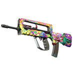
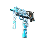
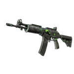
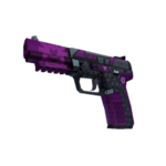
Evaluate the combination on its actual background
A standalone sticker can look good against neutral artwork yet become hard to read on a chosen finish. Review it together with the weapon rather than in two unrelated cards. Examine the area directly underneath, lettering color and neighboring artwork lines. For an already decorated candidate, use its individual inspection. When planning decoration, work with available previews before modifying a real item. A separate sticker image cannot establish the complete combination's readability.
Identify the composition's main accent
Decide what should attract attention: the finish artwork, sticker logo or overall color rhythm. Check whether details compete within one area. A large sticker over a prominent symbol can create clutter even when their colors match. A small readable sign on a restrained area may support the idea better. Do not choose placement solely because it appears brightest in a reduced icon; review the normal playing position too.
Light lettering over ornament example
Suppose a white logo sits over thin pale lines. The overall view merges those elements, while a close-up shows that the sticker itself is intact. The problem is background contrast rather than damage. For future decoration, consider a quieter area or another color combination. For an existing item, decide whether the result is acceptable without modification. Do not begin scraping merely as an experiment; assess the available images first.
Check visual compatibility
| Parameter | Question |
|---|---|
| Underlying area | Restrained or crowded? |
| Lettering | Distinct in tone and color? |
| Main artwork | Important symbol unobscured? |
| Playing angle | Readability retained? |
Review condition with the sticker wear guide and position with the placement guide. Find base designs by model and name in the finder. A suitable background is a visual task, not a match between rarity categories.