
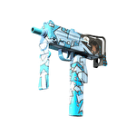


Why separate tone from saturation
A color image helps choose a palette, while a neutral tonal version shows how light and dark areas organize the artwork. This can help when two vivid finishes seem equally noticeable but one is harder to read. Keep the original and supplementary version together. An altered image is not new evidence of item color; it is a composition tool and should not be presented as an ordinary playing screenshot. Label the adjustment clearly.
Prepare a comparable pair
Match the original angle and scale for both candidates. If creating tonal versions, apply the same transformation to both images. Do not adjust one candidate's brightness until it becomes more attractive; that destroys comparability. Review the color originals first, then the supplementary pair. Record palette preference separately from main-artwork readability so one observation does not silently replace the other. Retain the unedited source images for the final review.
Two vivid designs example
Hypothetical design A uses saturated colors of similar lightness. Design B separates its main symbol more strongly from the background in tone. Both attract attention in color, while the supplementary view makes B clearer. That may help select readable artwork but does not prove A is worse in every scene. Return to the playing image: if a vivid color mass without a readable symbol is the goal, A may suit it.
Keep two independent assessments
| Check | Image to use |
|---|---|
| Preferred palette | Color original |
| Main-symbol separation | Original and tonal version |
| Fine-detail readability | Close-up |
| Playing appearance | Unedited playing screenshot |
Do not use image processing to determine rarity or value; neither follows from tonal structure. Read background contrast and lighting comparisons. Find named candidates in the finder, assessing their visual qualities separately.