

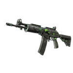

Choose inspection areas before sorting
Name the areas that affect your choice before reviewing the surface: body lettering, a slide edge, large artwork or the region near the sights. Sorting solely by float can favor a smaller number while overlooking an unwanted feature in the playing view. Valve's finish documentation describes different surface treatments. Do not expect different designs to produce the same visual impression at comparable values.
Build a map of visible areas
Use an overall playing view followed by two close-ups. In the overall image, check whether the main artwork is readable. In close-ups, examine the areas chosen in advance rather than becoming distracted by details absent during play. Repeat the sequence for every candidate. If the grip matters, show the grip rather than only a broad body view. Small lettering needs sufficient image resolution to support a judgment.
An example of competing priorities
Suppose item A has more readable lettering while item B has a tidier upper edge. If a readable logo in the normal playing position is your goal, A may suit you better. If the visible edge matters most, the preference changes. This is a hypothetical visual comparison, not a rule tying one float to one scratch. Establish your priorities first so an attractive picture does not silently change the criterion.
Assess areas instead of using one adjective
| Area | Inspection question |
|---|---|
| Main artwork | Visible in the playing position? |
| Small lettering | Readable without a close-up? |
| Visible edge | Acceptable in the normal view? |
| Grip | Consistent with the rest of the design? |
Add a specific observation to labels such as 'clean' or 'beautiful'. When candidates have different finishes, do not transfer one area's assessment automatically: artwork placement and important zones may change. Return to the skin finder if a different composition would better suit your priorities.